Roof coverings
Choosing a roof colour alongside the façade finish
In brief
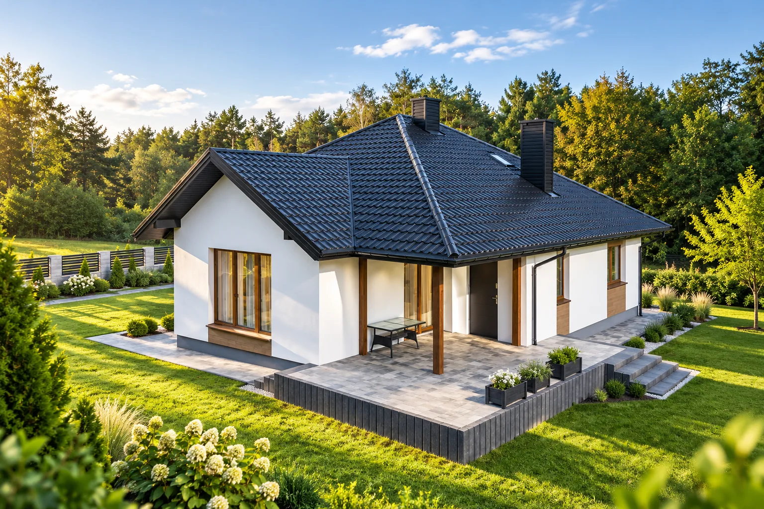
First identify the façade elements that are hard to change, and match the roof colour to them. In practice this means the joinery, plinth, stone, brick or prominent timber — these materials usually stay longer than wall paint. Set the covering sample against the window frame and garage door, and view it in natural light at an angle close to the real one. Also check how matt or gloss and the profile affect the perception of the shade. The aim is a deliberate relationship of colours, not an accidental collection of similar greys.
Which material should the comparison start with?
If the façade features stone, brick or prominent timber, treat these as an important reference point. They are usually harder to change than the paint colour on the wall. Compare the roofing sample with the window frame and garage door as well. Not everything needs to match perfectly. The aim is a considered relationship of colours, not a random collection of similar yet differing greys.
For a new house, you can prepare two or three complete sets. Each should include the roof, the main façade and the details at the eaves. Looking at the metal sheet samples alone makes the decision harder because there is no sense of scale. A large dark roof above a light wall gives a different impression from a small roof section that is partly obscured. It is worth taking these proportions into account in a simple sketch of the building.
How do pitch and profile affect the perception of colour?
A steep roof slope is sometimes visible almost like an additional façade. In such a house, the roof colour makes up a large part of the overall composition. With a shallow pitch, it is mainly the eaves and flashings that are visible up close. Their shade then becomes particularly important. Not all roofs should be judged in the same way on the basis of a uniform colour rectangle.
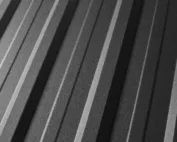
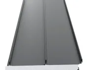
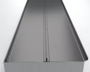
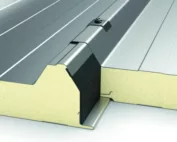
The embossing of tile-effect metal roofing and the waves of trapezoidal sheet create shadow. A taller profile usually differentiates light and dark areas more strongly. A gloss finish can further emphasise reflections, while a matt finish diffuses them. That is why a flat sample and a profiled one do not look identical. It is worth viewing a section of the actual sheet and its joint, ideally in the orientation it will have on the roof.
When should you choose contrast and when a calm combination?
Strong contrast separates the roof from the walls and emphasises the outline of the building. It can work well on a simple house if the other elements do not compete with one another. A similar tone gives a softer effect. However, this does not mean that almost identical colours must be used. Different texture and colour intensity can maintain a clear division without strong contrast.
With many additional elements, it is worth limiting the number of separate accents. The plinth, shutters, gutters and soffit can each introduce their own divisions. If each of them has a different strong colour, the roof stops organising the whole. Viewing the composition from a greater distance helps. This is a simple way to check whether the house is first seen as a volume or as many unrelated fragments.

How do you coordinate the roof with gutters and flashings?
The colour code is needed for ordering, but it does not guarantee that all materials will look identical. A different coating, texture or gloss changes the perception. It is best to compare actual samples of the roofing, flat sheet and gutter. The eaves are particularly important, where the elements meet along a long line. A small difference can be more visible there than on distant surfaces.
If you deliberately choose a different colour for the flashings, it should be justified in the design. It may reference the windows and doors or emphasise the edge. It is also worth checking the availability of all accessories in the same finish. A later replacement matched only by the name “anthracite” does not have to match. Keep the exact specification together with the roof documents.
How should you check samples on site?
View them in sunlight, in shade and under cloud cover. Place them next to the façade material instead of holding them separately against the open sky. Check the view from the street and from the garden. Greenery, neighbouring buildings and shading affect how the whole is perceived. A phone screen or a printout can help in choosing a direction, but they should not be the only confirmation of a shade.
For an extension, compare the new sample with the existing roof. The used material may have changed appearance through ageing and deposits. Even a matching code does not guarantee an invisible joint. Sometimes a better effect comes from separating the planes or planning a clear boundary. It is worth making the decision before ordering, while the arrangement of sections can still be changed.
What should you check beyond aesthetics?
Colour does not replace matching the coating to the environment. The selected finish should be available in a variant suited to the surroundings and application. A dark roof alone does not determine the temperature in the rooms either. The conditions under the roof slope are co-determined by insulation, ventilation, airtightness and glazing. The entire thermal effect should not be attributed to one visible layer.
Check the care instructions and the conditions concerning the appearance of the surface. On delivery, compare the shades under the same lighting conditions. Clarify any doubts before installation. A well-chosen colour is part of a complete decision: it matches the façade, has the right coating and is available on the required components. Such a choice is easier to keep consistent during later work on the house.
7 branches. Materials closer to your project.