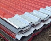
Roofs and flashings
How do you choose the colour of trapezoidal steel sheet to match the whole building?
Key points in brief
You look at the colour of the roof or façade for many years, in different light and from different distances. The RAL code helps to define it, but does not describe the gloss level or the texture of the coating. A good choice requires a sample and a view of the whole building. It is also worth checking how the chosen shade will affect the appearance of the flashings and later repeat orders. The code organises the name of the colour within a given system. It makes it easier to discuss the material and to match components. However, it does not guarantee an identical impression on every surface. Matt steel sheet, glossy paint on a gutter and rough render can look different despite the same designation.
What does the RAL code actually define?
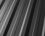
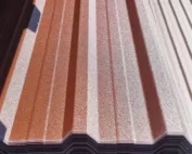
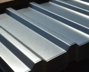
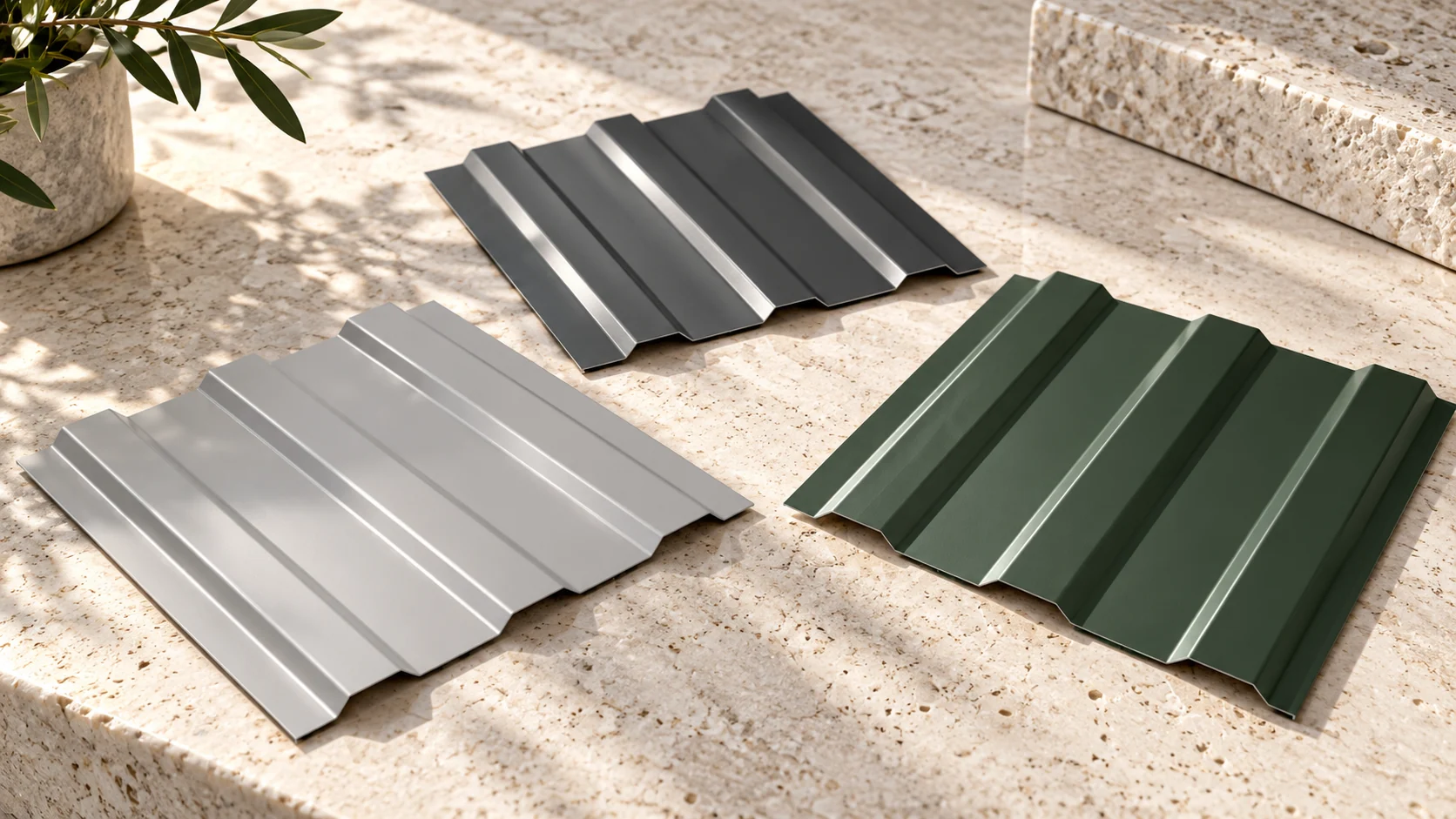
The substrate and the viewing angle also matter. On a trapezoidal steel sheet, some ribs reflect light while others remain in shadow. That is why the same shade on a flat sample and on a deep profile gives a different effect. It is worth viewing the sample laid out in a similar way to the future wall or roof slope.
Which colours are easy to match with a building?
Graphites, greys, browns, reds and greens are often found in offers. However, there is no single shade that is best for every building. With light plaster, a dark roof can emphasise the building’s form. With wood, calm greys or browns work well. The choice depends on the whole composition.
The frequent presence of a colour in catalogues should not be treated as a popularity ranking. What matters more is whether the given coating is available in the required profile and thickness. A shade present on the colour chart does not have to be available in all variants of the material.
How can you use several codes for comparison?
| Code | Starting point for the list |
|---|---|
| RAL 7016 | Dark grey against a light façade |
| RAL 7035 | Light grey on a calm rear wall |
| RAL 6005 | Deep green against timber and vegetation |
| RAL 8017 | Dark brown in a warmer composition |
These are aesthetic suggestions, not a reproduction of colours on screen. The actual material needs to be seen. It is particularly difficult to judge from a photograph the differences between graphite, black and dark brown in shadow.
Why is it worth comparing matt and gloss?
Gloss shows reflections of the surroundings more clearly. Matt can diffuse light more gently, though its texture also varies. On a large façade, the appearance changes as you walk past the building. A profile with stronger ribs further reinforces the rhythm of shadows.
In the example workshop in Kartuzy, a small wall sample can be compared with the door and render colour. This is a hypothetical method of assessment, without attributing a completed project to it. Look at the set in the morning and in the afternoon. Do not choose all materials under a single artificial light indoors.
Place the sample against the planned joinery and flashings. Assess the set in shade and in direct light. Different textures can look different despite a similar colour designation. This is particularly easy to notice on large flat surfaces seen next to each other.

Does a darker colour have any technical significance?
A sunlit dark surface can heat up more strongly than a light one under similar conditions. With long elements, thermal movement must be taken into account. Material and fixing requirements remain important regardless of aesthetic qualities. Colour is not merely decoration.
This does not mean a ban on using dark sheet metal. It means the need for a correct solution for lengths, supports and details. On flat fields, heating can also affect the visibility of waviness. It is worth discussing this before choosing a large, smooth and strongly sunlit surface.
How can differences be avoided when reordering?
Keep a full description of the coating, thickness and material batch. The colour code alone is not enough. A new sheet may differ from the old one due to texture, production series or natural ageing of the surface. On elements in direct contact, the difference will be more noticeable.
If a larger section needs to be supplemented, assess the division of the entire plane. Sometimes a logical boundary at a corner gives a better effect than a random new strip in the middle of the wall. Do not mask the difference by aggressive cleaning of the old coating. This can permanently damage it.
How can the choice be captured in a simple specification?
Enter the code, type of coating and its finish. Add the approved sample or an unambiguous material specification. Match the colour of flashings, gutters and visible fixings. If they are to contrast, note this deliberately. The absence of such a note may be treated as choosing one colour for everything.
Finally, look at the building from a distance typical for the user. A small canopy at the entrance is seen up close, while the roof of a hall is mainly seen from the road. Scale changes the perception of colour. Matching to a specific location gives a better result than being guided by one striking photo found on the internet.
Short answers
Does the colour on the phone match the colour of the steel sheet?
Not reliably. The screen, its settings and the light change the perception. The basis for selection should be a sample of the actual coating.
Do the gutters and the roof have to be exactly the same shade?
No. They can form a deliberate contrast. If they are to look identical, compare samples of both materials, not just the code reference.
7 branches. Materials closer to your project.